My friend Cheryl Rezendes has written a fantastic book that seems to cover every possible surface design technique. I've bought a couple for gifts, and wanted to recommend it as a wonderful resource for any artist friends who love to have new techniques at their finger tips, or a good place to review methods.
It's well written, and there are tons of photo's and diagrams. I'm not just saying this because she's my friend! Lyric Kinard also gave "Fabric Surface Design" a great review on her blog.
Here's the link to Cheryl's Etsy shop. Cherscapes Etsy shop
You can look through the chapters and get a good idea of how beautifully the book was done. Kudo's to Storey Publishing for seeing a wonderful opportunity in Cheryl's artistic background and down to earth style.
I hope you have a wonderful holiday, whatever you may celebrate!
Sunday, December 22, 2013
Tuesday, October 29, 2013
One way to hang a quilt
I like to use Levolor adjustable width pocket rods. They are almost flat and have a hole in each end where the nails can go, and they are adjustable. They come in two different lengths so I keep some on hand for different quilts. I buy them at Lowe's, but I would imagine they are available where ever Levolor curtain rods are sold.
This is the label for the shorter length rod:

The rod slips easily into the sleeve at the back of the quilt:


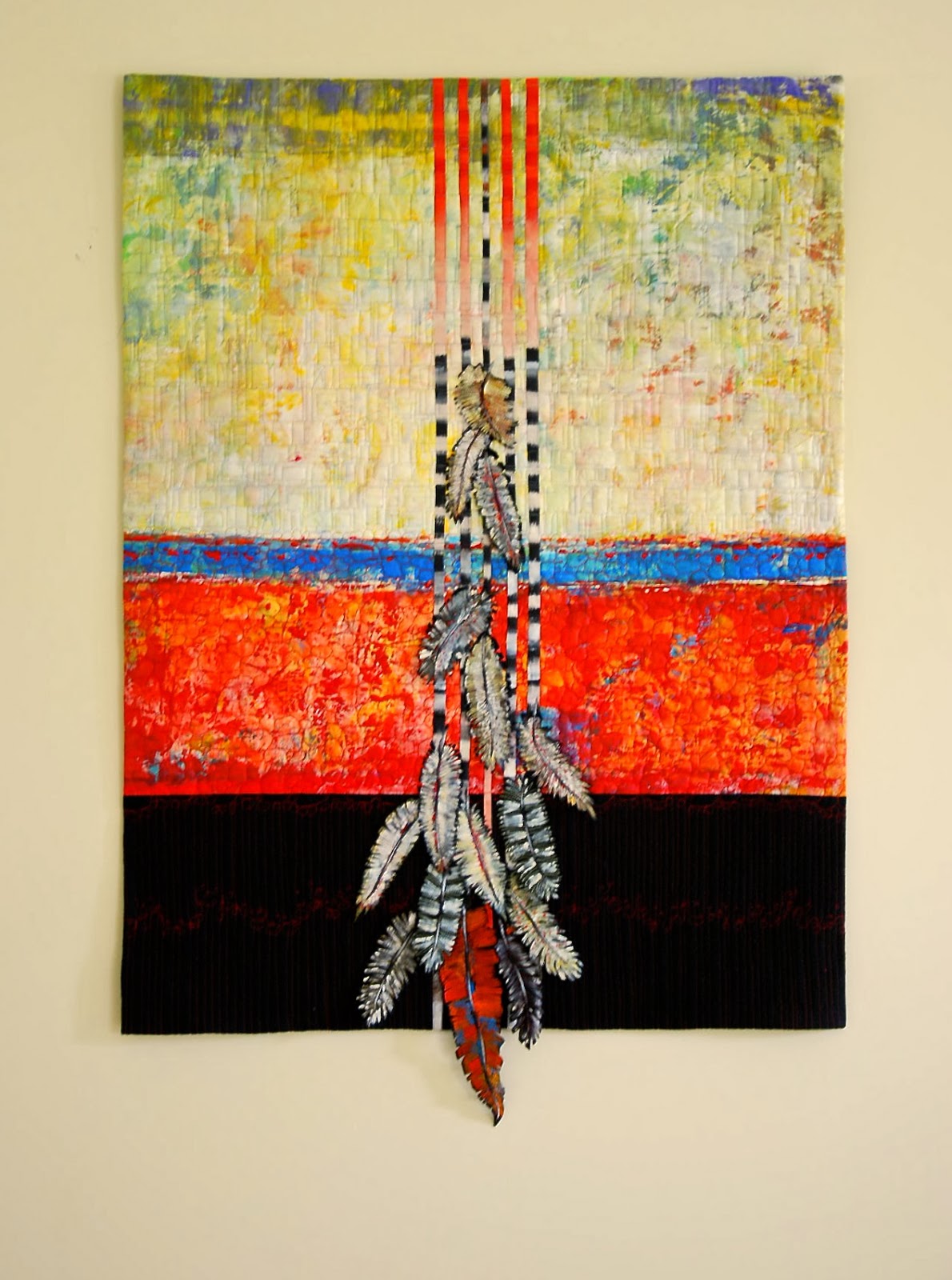
The feathers on the quilt are 3-D and have a wonderful textural quality to them. Please visit Susan's website to see more of her lovely work: Susan Szajer website and blog.

I hope this was helpful for you. If there are any questions, please put them in the comment section and I'll try to answer them asap!
Tuesday, October 15, 2013
Banksy in New York City
The British artist known as Banksy is in NY City, and is making art every day. He's got an amazingly inventive mind, and sharp sense of humor. There's a film that is sort of about him as well that is a hoot titled Exit Through the Gift Shop
Check his website out for yourself - and see NY differently!
Banksy's New York City Art
Check his website out for yourself - and see NY differently!
Banksy's New York City Art
Thursday, October 3, 2013
My Yellow Studio
My studio needed a paint job, and I was going to go with the same barn red color it was when we bought the house. That's what I did 5 years ago and it only needed one coat so it was the practical thing to do. But then I thought about how boring it was, and decided to go with a slightly deeper color than my house - on the other side of the driveway.
Here's the finished paint job -
 Won't it look great with a hanging basket of flowers on that hook and the window box on the window? Even from inside the house, it looks like it's calling me to come and feel the joy of creating!
Color can have a huge effect on how we feel and I know this color makes me feel happy and full of optimism. The studio floor is painted periwinkle for the same reason. Do you have a color that brings you joy?
I'm one lucky artist to have a space to call my own.
Next time I get the studio in order, I'll post photo's of the interior. Thanks for stopping by!
Here's the finished paint job -

Color can have a huge effect on how we feel and I know this color makes me feel happy and full of optimism. The studio floor is painted periwinkle for the same reason. Do you have a color that brings you joy?
I'm one lucky artist to have a space to call my own.
Next time I get the studio in order, I'll post photo's of the interior. Thanks for stopping by!
Tuesday, September 17, 2013
Art Quilts reviewed in Art and Antiques Magazine
There is a very informative, and appreciative review of the history of art quilts, and some of the major artists in the movement in the September issue of Art and Antiques Magazine. The author is Barbara Wysocki, a writer who is knowledgeable about the world of art and quilts.
It starts out the usual way that articles about art quilts begin - "Quilts—the word conjures bed covers made with tiny scraps of fabric stitched together with a layer of batting beneath a geometric or floral design." But, the second sentence brings the reader into the contemporary world of art quilts. Yeah! "Yet today, a kaleidoscopic range of quilts is being made primarily to be displayed on walls".
For anyone who is interested in learning more about art quilts, it's a broad and well written history. There are interviews with artists, and examples of their work. I heard about the article through the Studio Art Quilt Associates list serve, and am so encouraged to see art quilters getting serious reviews.
Wednesday, September 4, 2013
Starting on a 12" square
When I've been away from the studio for awhile, I like to start working on something small to get me back into the swing of things. It sounds strange, but it is sometimes hard to remember how to start in the studio. It's easier to get the work going when starting small.
The SAQA auction is coming up next week, and although I already submitted a 12" square piece for this year, the deadline often comes and I have to rush to make something. So, I started a 12" piece and if I still like it next April, I'll submit it for the 2014 auction. Here's a link to this year's auction and my piece. You'll see that it has some of the same fabrics. SAQA 2013 Auction
I think in terms of background, middle ground and foreground as I've noted before. My photography training taught me to be sure there is something interesting in each area, so it's easiest for me to go from there. I photographed the process with my IPhone, so the photo's aren't great, but they are done!
Here's how I started:

I think I probably spent about 8 hours on this all together. Not including dyeing the fabric of course... I'm not fast at dyeing, designing, or finishing. It has worked as a good start to get me comfortable in the studio again.
Do you work in a similar way?
The SAQA auction is coming up next week, and although I already submitted a 12" square piece for this year, the deadline often comes and I have to rush to make something. So, I started a 12" piece and if I still like it next April, I'll submit it for the 2014 auction. Here's a link to this year's auction and my piece. You'll see that it has some of the same fabrics. SAQA 2013 Auction
I think in terms of background, middle ground and foreground as I've noted before. My photography training taught me to be sure there is something interesting in each area, so it's easiest for me to go from there. I photographed the process with my IPhone, so the photo's aren't great, but they are done!
Here's how I started:
 |
I had this fabric and the next one on my cutting table from this year's auction piece. |
 |
| Added some Misty Fuse to each fabric and ironed them on |
 |
| Put the smaller pieces on this background and started moving things around. |
 |
| The next few photo's are of some of the things I tried out and then changed. |
 |
| I added the yellow piece in the lower area. I liked the thin piece coming down and across. Maybe it's a "J"? |
 |
| Thought it needed more pop, so I found a fabric in a complementary color. I also wanted to emphasize the horizontal movement. |
 |
| I added and subtracted blue fabric, and then cut some up to make the line more interesting. |
 |
| Thought it might need the blue to end the horizontal line |
 |
| Cut the end pieces smaller and moved the red in and out of the blue shapes. |
 |
| Ironed them on...always a little scary because it's hard to change anything after ironing. |
 | ||
Auditioned some threads to see what would work |

After the black thread, I thought it needed "something" else
 |
Added the rectangles and free motion quilted them |
 | |||||||||||||||||
| Trimmed it to 12" square and ironed some Misty Fuse to black fabric and added it for binding. |
 |
| The finished piece. |
 | ||||
| The back - sleeve and all! |
I think I probably spent about 8 hours on this all together. Not including dyeing the fabric of course... I'm not fast at dyeing, designing, or finishing. It has worked as a good start to get me comfortable in the studio again.
Do you work in a similar way?
Monday, August 26, 2013
Serendipity
I love that word, and love when it happens! We're visiting our old neighborhood, friends and family in Silver Spring, MD and environs. My husband and I went to one of our favorite restaurants - Mandalay - a Burmese restaurant in downtown Silver Spring. As we were contemplating the menu and trying to remember what were our most enjoyed dishes, I heard two women talking behind me.
I kept hearing SAQA (Studio Art Quilt Associates) and SDA (Surface Design Association). I knew they had to be kindred spirits so I turned around and introduced myself. It was Ann Graham, who lives in Silver Spring and is on the SDA Board, and Dominie Nash, who has a studio in Washington, DC and is a well known Art Quilter. We laughed about what a small world it is.
The SDA website was recently updated, and I remarked at how helpful it is once you start poking around. Since I live in a rural, small college town place, I don't have access to regular meetings of art quilters and all the information that gets shared in those meetings. We agreed on that and said goodbye.
If we had time, and they the inclination, I would have loved to join them and talk more about the long term goals of both SAQA and SDA, but we were off to see "The Butler". I loved the film, and hope it gets seen by millions of people!
Friday, August 23, 2013
Website finally completed!
Well, almost. I have gotten great feedback from people and they've figured out all the little things that need to be fixed. It's very helpful to have so many eyes looking over the site, especially those with some understanding of how to use Wordpress. Generous people gave me hints and I plan to fix some problems - like the contact page isn't working - as soon as I can get to it.
The website link is on the right of the blog - Jeanne Marklin Website
Now that I have a website up, I look forward to hearing from more people as I share new work. Please be patient about the contact page - or write a comment here and I'll get it. Getting comments helps us to know that we aren't just writing for ourselves!
Monday, July 8, 2013
Bennington Art Guild Gallery opening

The opening at the Gayle Garrison Gallery in the Bennington Arts Guild gallery on Friday night was wonderful! It was hot outside, and very warm inside, both from the weather and the friendly faces who came to support me and Josh Primmer. We had lots of compliments about how well Josh's pottery and my art quilts made for a cohesive exhibit. Josh and I both agreed that Ceil Petrucelli had a good idea when she invited us to exhibit together.
I love hearing what people say about my work, because they see things that I don't and it's always interesting to hear how it is viewed. "Evocative" was a word I heard from several people, and I liked that. The exhibit will be up until July 29, so if you're in the area, please stop by. There are lots of good restaurants in Bennington, and a great bakery around the corner from the gallery. Tempt you yet?
Sunday, June 30, 2013
Bennington Arts Guild Gallery exhibit
I was honored to be invited to have an exhibit at the Bennington Arts Guild Gallery. The opening is this Friday, July 5, 2013 from 5 - 8 pm, and I will share the space with Joshua Primmer, a ceramics artist from Bennington, VT.
I've invited lots of friends and am hoping many will come and make it a party. The exhibit will be up until July 29 so there is plenty of time to see it if you can't make the opening. Bennington is a great little town to wander around and enjoy on a summer day.
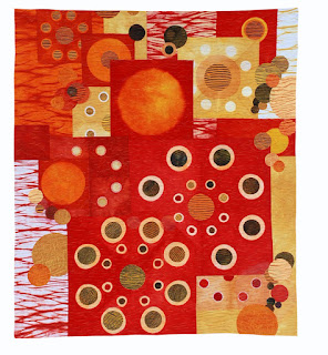
Here's a sneak peak at a couple of the art quilts that will be exhibited:
I've invited lots of friends and am hoping many will come and make it a party. The exhibit will be up until July 29 so there is plenty of time to see it if you can't make the opening. Bennington is a great little town to wander around and enjoy on a summer day.
Here's a sneak peak at a couple of the art quilts that will be exhibited:
 |
| detail of "Time Heals" |
 |
| detail of "Before/After" |
Saturday, June 22, 2013
Dyeing to Discharge workshop by Carol Soderlund
Carol Soderlund teaches the best dyeing workshops in my not so humble opinion. I was able to take her "Dyeing to Discharge" workshop at PRO Chemical and Dye in Fall River, Massachusetts. I had been interested in learning discharge techniques but was concerned about the health affects. Carol is very knowledgeable about toxic affects, and emphasizes safety in every lesson.
We learned to discharge with bleach, thiox and deColourant, and to always wear a respirator while working with either chemical - whether inside or outside. With bleach, we wore masks while we were leaning over the buckets. Bleach is always rinsed in water, and then an Anti-chlor solution rinse after that to stop the bleach from eating away at the fabric. When ironing thiox or DeColourant to discharge we always wore masks. Thickened Thiox and thiox with dye added (illumination) were used, and the effects were so inspiring!
Carol had us test about 12 colors of dyes and 6 blacks, and we sampled 27 different commercial fabrics for discharge. Our class produced some wonderful fabric by the end of the week. I'm posting a few photo's from the class. If you'd like to learn Discharging techniques, Carol is a thorough, organized and generous teacher, and sweet on top of all that! And PRO Chemical is an excellent place to take dye classes. It's what they do, and there is always an expert on the premises if there are any questions that the workshop instructor can't answer.
We had a great group of students who made lots of fabric. Here's some of our work pinned up for everyone to enjoy.


We learned to discharge with bleach, thiox and deColourant, and to always wear a respirator while working with either chemical - whether inside or outside. With bleach, we wore masks while we were leaning over the buckets. Bleach is always rinsed in water, and then an Anti-chlor solution rinse after that to stop the bleach from eating away at the fabric. When ironing thiox or DeColourant to discharge we always wore masks. Thickened Thiox and thiox with dye added (illumination) were used, and the effects were so inspiring!
 |
| Watching the bleach discharge and in anticipation of removing it at the right time. |
We had a great group of students who made lots of fabric. Here's some of our work pinned up for everyone to enjoy.
 |
| My fabrics |


Wednesday, June 12, 2013
Fabulous Fabric and Fiber exhibit
The organizers of the Fabulous Fabric and Fiber show in New Marlborough invited area artists to enter work to be exhibited in the New Marlborough Village Meeting House Gallery. My work was accepted and I'm excited to be a part of a local exhibit and to meet more artists from the Berkshires. The opening is this Friday, June 14, from 5-7 pm. There will be the usual delicious offerings and wine, and a chance to see some very diverse fiber art, including art quilts, baskets, clothing and wonderful needlepoint.
My thanks to Pamela Johnson, another art quilter and SAQA member who made me aware of the show. We're going to enjoy the opening with our husbands, and then dinner afterwards at Pam's house. If I'm lucky, there will be enough daylight to see Pam's extensive garden.
The gallery is open on Friday, Saturday and Sundays from 11-4. It would be great to have some friends there to share the excitement!

Monday, May 13, 2013
Patty Hawkins' words of wisdom

Patty Hawkins' session on her artistic path was one of the break out sessions at the SAQA conference. Patty was full of energy and enthusiasm as she spoke about her "Art Odyssey". She gave some very good information as well as making us laugh, ooh and ahh.
Patty is a kind and generous woman. She gave us lots of information about how she worked. She emphasized that welcoming any newcomer to the art quilt community was important. Although she had been working in water color for 15 years, when she found art quilts, she knew that was how she wanted to work in the future. Patty said that when her work was first accepted to Quilt National and the American Craft Museum, it gave her a lot of confidence in her work.
Patty's work has been accepted into Quilt National seven times, and three times into Quilt Visions. Anyone who is that successful is full of experience and good methods!
The first thing she recommended for advice on design was to "Simplify, Exaggerate and Repeat". If you look at her work you can see exactly how she does that to make work rich in depth and feeling. She creates her fabrics using screenprinting, dye and shibori methods. Her aspen trees are repeated in different sizes, and the leaves and other elements are also simple, but repeated to great affect. The Red Tori Gates piece uses the red gate, repeated over and over in a simple, but striking composition. Patty was inspired to make a series of quilts after her visit to Japan. She was awarded the trip when she won the Quilts Japan prize in 2006 from Quilt Visions.
Patty recommended that the artist play to a theme that you are passionate about, and listen to others suggestions. We've all heard suggestions from others and thought they weren't useful. Patty said she might not like what she hears, but she tries them out anyway, and finds her friends are often right, and the piece is improved through their feedback.
Putting lights and darks next to each other was another tip she gave, as well as adding a tiny bit of complementary color to lead the eye around the composition. Patty does fused collages, and often uses tulle over parts of them. Sometimes she sews shapes on the tulle, and then cuts some of them out, creating a negative shape.
After having an hour with Patty, I would love to take a workshop with her. She is so talented, friendly and giving. Please visit her website and enjoy her work!
Wednesday, May 1, 2013
Enjoying time with SAQA colleagues
The SAQA conference in Santa Fe was jam packed with information, inspiration, networking and good times. This year there were 3 break out sessions, with enough time between the sessions to network, and catch up with friends. We had a banquet with a key note speaker, a cocktail party with a silent auction, and lots of meals and laughs.
The conference is a high light of every year for me. I don't live near many SAQA members, so I don't get an intense experience on a monthly basis. Attending the conference helps me feel I'm with people who love what I love - and they also happen to be very friendly and kind to each other.
Over the next few weeks, I'm going to post about some of the things I learned and/or experienced at the conference in Santa Fe. For now, I'd like to say thank you to the organizers! Here's a photo that shows some of them:
 L-R Bill Reker (SAQA shipping expert), Deb Cashatt (a huge volunteer and organizer of the auction at the conference), Kris Sazaki (vice president of SAQA and a Pixelady with Deb Cashatt), Martha Sielman (executive director and writer), Sandra Sider (behind Martha and present President of SAQA), Mary Pal (special exhibitions coordinator), Leni Wiener (exhibition committee chair) and Linda Beach (board member). Desiree Vaughn isn't it the photo, but she was the main conference organizer and had everything running smoothly.
The keynote speaker for the banquet on Saturday night was Geoffrey Gorman. He was smart, knowledgable and funny. Just the right mix of quirk and sincerity. He makes wonderful animals out of found objects and has a lot of experience in the art world. Geoffrey has been an artist, artist representative and had many other roles in and out of the art world. One of the things he said that stayed with me was "Our lives are transforming all the time, and so is our work". A good reminder that we don't have to keep producing the same thing - our art can grow and change as we do.
He described himself as an aggressive marketer of his own work, and always expresses to potential collectors that he's doing the best work he's ever done. He recommended that we know our work, its premise, and our market.
Geoffrey has some video's on YouTube that give you a quick look at his work, and give a sense of his humor and perspective on life. Take a look when you get a chance - his animals are full of life.
His work is in 6 galleries around the country, including the Jane Sauer Gallery in Santa Fe. Judith Content, one of my favorite fiber artists also has an exhibit there, and spoke to us on Saturday afternoon. I'll save that for another post!
The conference is a high light of every year for me. I don't live near many SAQA members, so I don't get an intense experience on a monthly basis. Attending the conference helps me feel I'm with people who love what I love - and they also happen to be very friendly and kind to each other.
Over the next few weeks, I'm going to post about some of the things I learned and/or experienced at the conference in Santa Fe. For now, I'd like to say thank you to the organizers! Here's a photo that shows some of them:
The keynote speaker for the banquet on Saturday night was Geoffrey Gorman. He was smart, knowledgable and funny. Just the right mix of quirk and sincerity. He makes wonderful animals out of found objects and has a lot of experience in the art world. Geoffrey has been an artist, artist representative and had many other roles in and out of the art world. One of the things he said that stayed with me was "Our lives are transforming all the time, and so is our work". A good reminder that we don't have to keep producing the same thing - our art can grow and change as we do.
He described himself as an aggressive marketer of his own work, and always expresses to potential collectors that he's doing the best work he's ever done. He recommended that we know our work, its premise, and our market.
Geoffrey has some video's on YouTube that give you a quick look at his work, and give a sense of his humor and perspective on life. Take a look when you get a chance - his animals are full of life.
His work is in 6 galleries around the country, including the Jane Sauer Gallery in Santa Fe. Judith Content, one of my favorite fiber artists also has an exhibit there, and spoke to us on Saturday afternoon. I'll save that for another post!
Tuesday, March 5, 2013
First acceptance of 2013!
I wanted to start 2013 off with lots of energy and plans so I've entered 3 exhibits in the past two months. I'm still waiting to hear from one, but did have 2 quilts accepted to the Connecticut SAQA region show "Local Color". The show will premiere on May 4, 2013 at the Western CT State University, and then travel to at least 2 other venues. I'm honored to be a part of this show because the CT region has some excellent art quilters, so I'm sure it will be a beautiful show.
Although I live in Massachusetts, Connecticut is my second region, and I try to attend a meeting at least once a year. It's a very active SAQA group with informative meetings and friendly artists.
Blowin' Glass is one of the quilts that was accepted. It is made of fabric that I made using shibori techniques. They reminded me of blown glass and so I arranged them as if they were a still life on a table.
The other piece that was accepted is "Melting", which premiered at the Taiwan International Quilt show last year. You can see it here. I'm grateful that I was invited to enter this juried show, and look forward to going to see the exhibit in May. Thanks to the organizers and the SAQA CT reps -
Kate Themel, Diane Wright and Catherine Whall Smith, for all their hard work!
Although I live in Massachusetts, Connecticut is my second region, and I try to attend a meeting at least once a year. It's a very active SAQA group with informative meetings and friendly artists.
 | ||
| Blowin' Glass c.2013 |
Blowin' Glass is one of the quilts that was accepted. It is made of fabric that I made using shibori techniques. They reminded me of blown glass and so I arranged them as if they were a still life on a table.
 |
| Blowin' Glass detail c.2013 |
The other piece that was accepted is "Melting", which premiered at the Taiwan International Quilt show last year. You can see it here. I'm grateful that I was invited to enter this juried show, and look forward to going to see the exhibit in May. Thanks to the organizers and the SAQA CT reps -
Kate Themel, Diane Wright and Catherine Whall Smith, for all their hard work!
Thursday, January 17, 2013
Writing on fabric
Recently, there was a question on a list serve about pens or paints that will write in white on fabric. I have used a white pen on my quilt labels for the past few years and really like the contrast of white on colors. Plus, I keep having problems with my printer and fabric, so using my own writing is easier.
A follow up question to my post about the Signo white Uni-ball pen was about its water resistance. I decided to check it out, since art quilts aren't meant to be washed, and I had no idea of its water resistance.
Here are photo's of my test. The first two are the "before" washing, and the second two are "after" washing. I don't see a difference:


 I went over each letter a couple of times because the fabric does soak up some of the ink. It works great on dark paper as well. It would be great if they would make it in a larger pen size.
A follow up question to my post about the Signo white Uni-ball pen was about its water resistance. I decided to check it out, since art quilts aren't meant to be washed, and I had no idea of its water resistance.
Here are photo's of my test. The first two are the "before" washing, and the second two are "after" washing. I don't see a difference:


This year's mindfulness reminder
Last year, I received the book "The Happiness Project" by Gretchen Rubin for Christmas. It was a surprisingly helpful book. I gained a few insights that were useful for being happier. Rubin has a list of things that she wants to be more mindful of, including "let it be". It sounded like a shorter version of the Serenity Prayer, which I can never remember in the right order. "Let it be" was my mindfulness mantra for the year, and was helpful.
Around New Years, I had been in a bit of a cranky mood, and realized that whenever I had a negative thought, I felt even crankier. So, I decided to use the mantra of "be generous" for this year. It's a reminder to me that when I'm having critical thoughts about someone's behavior that I need to be more generous. For example, the car in back of me is driving too closely. I might like to slam on my brakes and give them a scare, but being generous would be thinking about the fact that they might be very nervous about being late for work, a doctors appointment, picking up a sick child from school - anything that might make someone feel a bit overwhelmed.
I also hope to be more generous to myself! When I'm working in the studio and things aren't going well, instead of thinking I'm a crappy artist and should give up and do something else, I'm going to remember that everyone feels this way during the process of creating, and that it's just part of the process. And probably eat some chocolate to make myself feel better too. Having a mindfulness mantra has been helpful for me, and I recommend it. Leave me a comment if you have had one too - whether it worked, or not!
Subscribe to:
Comments (Atom)